
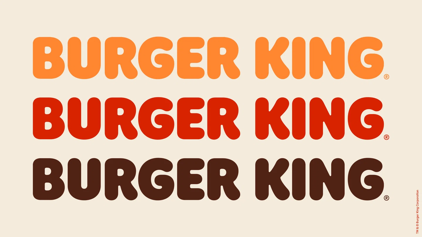
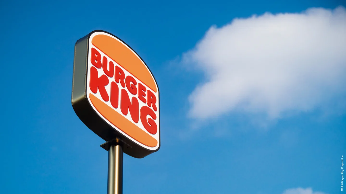
The new identity – designed by the in-house creative team together with JKR New York over two years – features a new logo, which in fact, returns to an old logo first used in the late 60s. Said logo depicts its word mark in bubbly type between two buns, but the new version subtly tweaks the type, shape and colour. It also includes a new brand font called Flame, designed to mimic the shapes of Burger King food, as well as an updated colour palette, set of photographic assets, and redesigned uniforms and packaging.
The first iteration of this logo first launched in 1969 and, with some minor tweaks, remained until 1999, when the existing logo was brought in. This added a slight serif to the type and put the word mark on a slant, making the buns subtly 3D and encasing the logo in a blue border. In this rebrand the blue is gone and the logo is stripped back to its most gloriously retro essence, aiming to create a “minimalist” icon that “seamlessly meets the brand evolution of the times and pays homage to the brand heritage.
With refined design that’s confident, simple and fun, the result is a symbol far better aligned with the brand's image, visually combining mid-century flair with modern sensibilities.
“We redesigned our logo intentionally inspired by our identities from 1969 to 1998, which were authentic, confident, simple, genuinely Burger King,” Raphael Abreu, global head of design for Restaurant Brands International, Burger King’s parent company, “So we modernised a classic, making sure the new design was long-lasting, timeless. We adjusted the bun shapes and proportions, making it closer to our burgers. The type was streamlined, rounded but still keeping some of our fun and friendly personality. We are extremely proud to be able to find in our own history the path forward to our brand.”
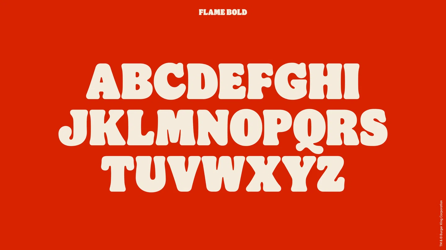
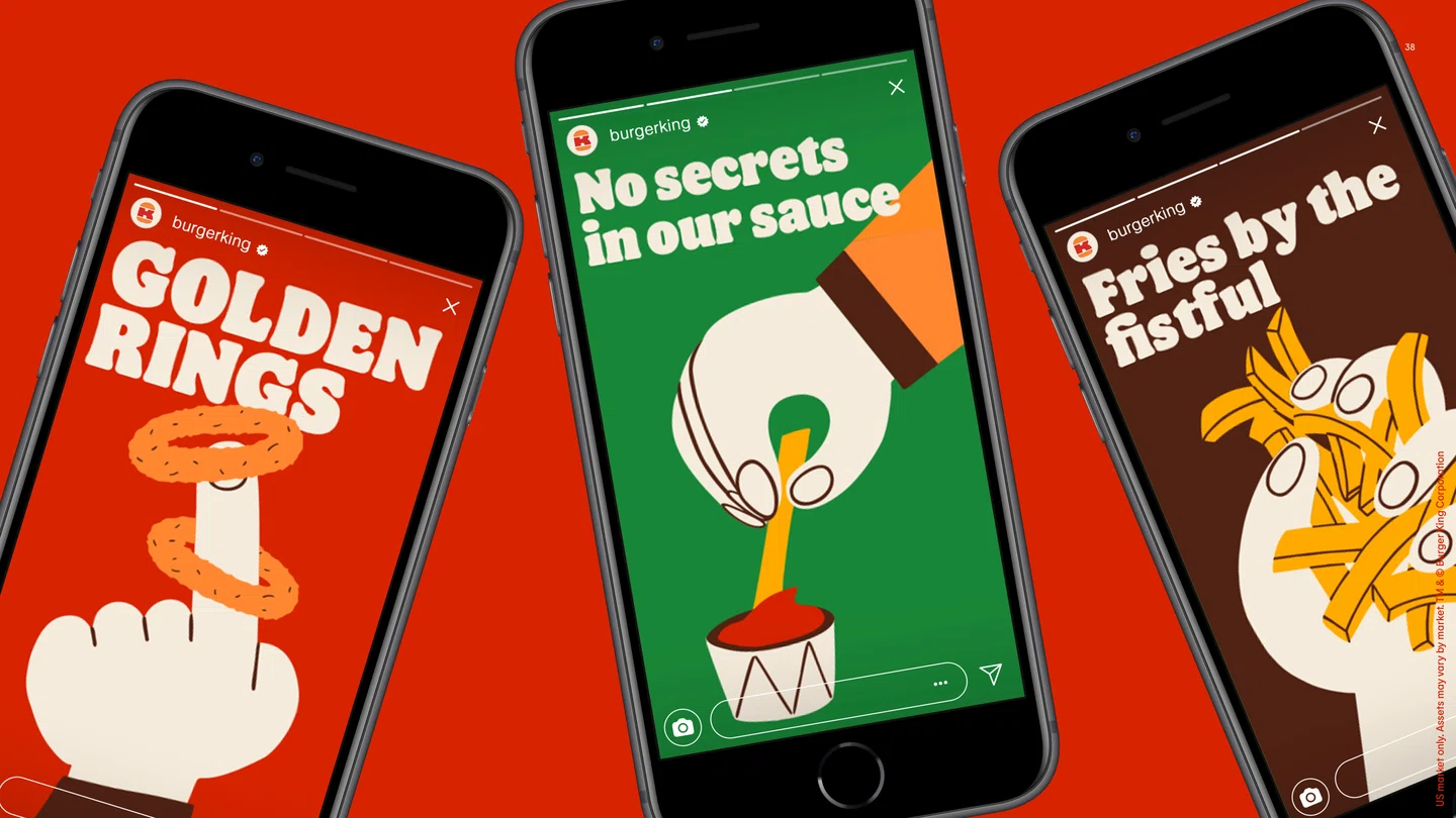
The Flame brand font family was designed by Colophon Foundry with three variants: bold, regular and sans. It's inspired by the shapes of the restaurant’s food, “rounded, bold, yummy,” continues the statement from BK, and aptly channels elements of the brand’s tone of voice.
“We wanted a font that would make people want to take a bite out of it. We are also very playful and bold in how we use the new font. There is a variable version where we stretch and compress it and create expressive and impactful illustrations with it.”, Abreu adds.
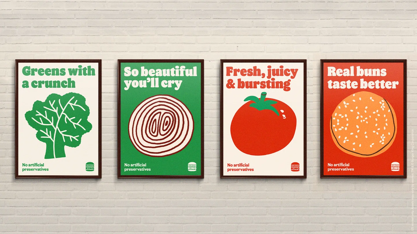
Colours are “unapologetically rich and bold” drawn from the brand’s flame-grilling process and ingredients, and named accordingly. “Fiery Red, Flaming Orange and BBQ Brown are part of our primary palette, which holds some equity and has been in the brand for a while. Mayo Egg White, Melty Yellow and Crunchy Green are our secondary palette.", Abreu adds.
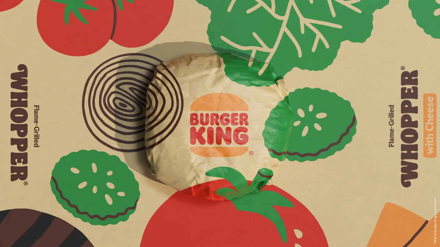
Meanwhile the illustrations by Cachete Jack deftly convey that aforementioned playfully irreverent personality, and photography is “hyper textured and dials up the sensorial aspect of the food”. All these aspects have been designed with digital platforms front of mind.
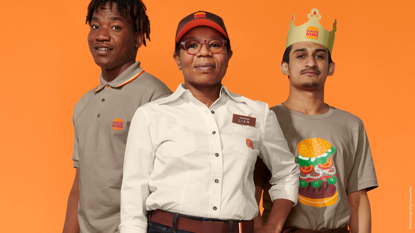
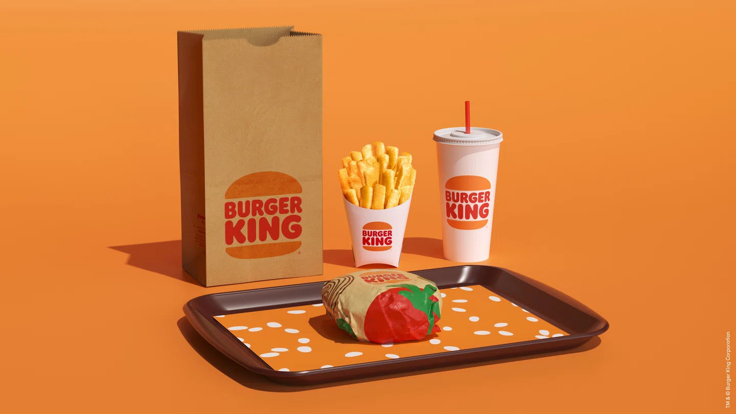
The new uniform designs made in collaboration with Bryce Barnes are intended to mix contemporary street style with comfort, emblazoned with distinctive colours and graphics, while the packaging celebrates the newly revamped logo, alongside playful illustrations of ingredients and an impactful use of the characterful new typeface.
“Design is one of the most essential tools we have for communicating who we are and what we value, and it plays a vital role in creating desire for our food and maximising guests’ experience,” says Abreu. “The large majority of the elements were completely reimagined. Since 1999 when the previous logo was launched, many things have changed in the world of brands and in Burger King.”
He adds that Burger King is reinventing its brand from the ground up, removing flavours, colours and preservatives from artificial sources to all food in the menu, heavily investing in technology to improve the guest experience in restaurants and in mobile devices, and making some big commitments about sustainability on both food, planet and communities fronts.
“Considering all these changes, we thought that the current visual identity wasn’t reflecting us as a brand anymore. And we needed a visual expression that could dial up taste and quality through design.”
The new identity can already be spotted on the Burger King website, and will roll out to everything from social media to menu boards and interiors at its 18,800 restaurants globally over the next few years.
If you’re looking for a rebranding of your company, why not check out Rtist? We have our Creative Talents who are able to work together with you to refresh your brand from ground up. We have one of the biggest creative talent communities in Malaysia that has just the thing for you. We also have our Handpick Service, which helps you find the most suitable creative talent within 3 days!